Creating a calm and peaceful environment in your home starts with the right color choices. The colors you surround yourself with can influence your mood, energy levels, and overall sense of wellbeing. Whether you’re repainting a single room or refreshing your entire home, selecting calm colors can help transform your space into a relaxing retreat. In this post, we’ll explore practical tips for choosing calm colors that suit your style and promote tranquility.
Why Choose Calm Colors?
Colors have a powerful impact on our emotions. Bright, bold hues may energize and inspire, but calm colors tend to soothe and relax. Homes painted with soft, muted tones often feel more inviting and restful. Calm colors can also make a room appear larger and more open, which contributes to a peaceful ambiance.
Popular Calm Colors to Consider
Before diving into tips, here are some popular calm color families commonly used in home decor:
– Soft Blues: Often associated with the sky and sea, blue promotes relaxation and focus.
– Muted Greens: Reminiscent of nature, green creates balance and renewal.
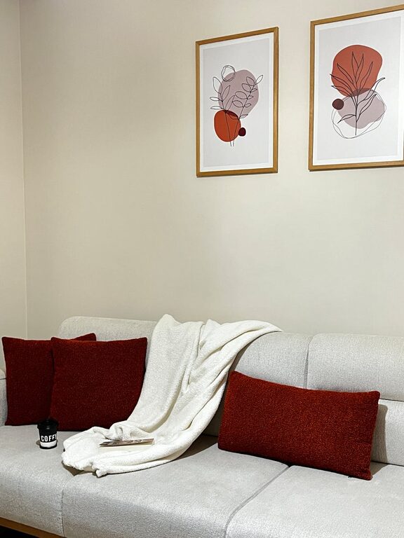
– Warm Neutrals: Shades like beige, taupe, and warm grays offer a cozy yet understated backdrop.
– Gentle Lavenders and Purples: These hues provide a subtle touch of sophistication and calm.
– Pale Pinks and Peaches: Soft, warm pastel tones add a nurturing feel without overwhelming the space.
Tips for Choosing Calm Colors
1. Understand the Mood You Want to Create
Before selecting any paint, think about how you want to feel in the space. Are you looking for a room to help you unwind after work? Or maybe a calm but productive home office? Identifying the room’s primary function helps narrow down suitable colors.
– For relaxation areas like bedrooms or lounges, focus on soft blues, light greens, or warm neutrals.
– For a calm yet energizing vibe, consider pale peach or muted lavender.
– For workspaces, calm shades of green or blue can improve concentration while reducing stress.
2. Test Colors in Natural Light
Colors look different depending on lighting. Natural daylight shows the truest color, while artificial lighting can add warm or cool tones. To get a better idea of how a color will look, apply sample swatches on your walls and observe them throughout the day.
– Check the paint under morning light, midday sun, and evening lamps.
– Notice if the color feels too cold, warm, or dull.
– Adjust your choices accordingly based on your observations.
3. Use a Color Palette for Balance
Choosing calm colors doesn’t mean your space has to be boring or monochrome. Use a palette of related shades to add depth and interest while maintaining tranquility.
– Select a primary calm color for walls.
– Add complementary or analogous hues for furniture, textiles, and décor.
– For example, pair a soft blue wall with beige accents and muted green cushions.
4. Consider the Finish
Paint finishes affect how colors appear and how they feel in a room.
– Matte and eggshell finishes soften colors and reduce glare, enhancing a calming effect.
– Satin or semi-gloss finishes reflect more light but might feel less cozy.
– Use finishes strategically; for instance, matte on walls and satin for trim or doors.
5. Limit Bold Accents
If you love bold colors, you can still incorporate them without sacrificing calmness. Use them sparingly as accent pieces like throw pillows, art, or rugs.
– This approach keeps the overall atmosphere peaceful.
– It adds personality and interest without overwhelming your senses.
6. Think About Room Size and Ceiling Height
Calm colors can also influence how spacious a room feels.
– Light, cool colors generally make a room feel larger and more open.
– Dark or warm calm tones create a cozy, intimate atmosphere, which may be great for bigger rooms.
– Pale colors on ceilings can increase the feeling of height and airiness.
7. Coordinate Colors Across Your Home
For a seamless flow, consider how your chosen calm colors relate from one room to the next.
– Select a family of soothing colors that complement each other throughout the house.
– This creates continuity, contributing to an overall peaceful living environment.
8. Personalize Your Choices
Ultimately, your home should be a reflection of what makes you feel calm and comfortable. Don’t just pick colors because they’re “popular” or “in trend.”
– Take inspiration from your favorite places, such as a beach, forest, or garden.
– Choose colors that resonate with you personally and make you feel at ease.
Maintaining Your Calm Space
Once you’ve chosen calm colors and decorated your home, keep your space clutter-free and well-organized. Calm colors pair best with tidy surroundings, soft lighting, and natural elements like plants or wood accents.
Final Thoughts
Choosing calm colors for your home is a rewarding process that enhances your wellbeing and creates a sanctuary you look forward to spending time in. By understanding the mood you want, testing colors in your space, and balancing your palette thoughtfully, you can find the perfect soothing hues for your home. Remember, calm colors don’t have to mean dull — with the right combination, your rooms can be both tranquil and inviting.
Happy decorating!